Comprehensive Art Education
Richard Paul Lohse: Observation of Artwork
Designer Richard Paul Lohse was born and raised in Zürich. When Lohse was younger, he wished of becoming a well-known painter but because of World War I, plans were put to a halt while France and Lohse himself were struggling with the crashing economy. When Lohse was only fifteen years of age, he started painting still life’s in a realistic style. In 1917, as Lohse started to paint, one of the last art movements to hit Russia and eastern Europe was constructivism (ArtStory). This movement is a combination of cubism (made to be simple shapes, interlocking plans, and collage like aspects (Merriam-Webster, p. 2)), suprematism (simple geometric shapes and had ideals of spiritual purity (Merriam-Webster, p. 3)), and futurism (ideas of events and trends of the future or which anticipate the future (Merriam-Webster, p. 1)). These movements all influenced Lohse in his early life which would continue into his later work and until his death in1988.
With Lohse’s dream of going to Paris to study becoming less of a possibility, he was able to find a replacement when he took an apprenticeship with graphic designer Max Dalang. At the time, Dalang was the most renown graphic design artist in Switzerland. After the internship with Dalang, at the age of twenty Lohse was hired to work within the advertising studio (Lohse, p. 2). While he was working at the advertising studio, Lohse has the opportunity to meet designers Hans Neuburg and Anton Stankowski. These two designers are best known for working with emotion and portraying the concept to the people. In Lohse’s later work, we see the influence of Stankowski in his work using minimal color along with shapes and lines to create context. Throughout his life, Lohse became a founder to many organizations that all supported local and country-wide artists and graphic designers (Lohse, p. 2). In 1930, Lohse along with another ex-employee names Hans Trommer started their own advertising studio in Zürich but because of war and economic troubles, the company shut down in 1934. Due to Stankowski’s work permit ending, he had to leave Switzerland and Lohse behind to go back Germany. After joining the army and being freed from P.O.W. in 1948, he returned to Germany to work as a graphic designer and photographer (Stankowski). During World War I along with the beginning of World War II, a majority of Lohse’s work was advertising or political artwork that has been destroyed over time (Lohse, p. 4).
One of his early still life’s in the artistic style of impressionism is Coffee Pot (figure 1), which was completed in 1925 is an oil on canvas composition. This painting shows where Lohse was as a student and what his work mainly consisted of. Coffee Pot is a fairly large painting consisting of bright colors mixed by overlapping complementary colors and wide range of warm and cool shades to create shadows and highlights. Lohse also creates a theme of repetition by using similar shades and shapes to unify the painting as a whole. This technique could be what started him in graphic design by experimenting with repeating shapes and colors which can be spotted in his later works. After Lohse passed, his working style was described by Donald Judd in 1988:
The attitudes implicit in Lohse’s work, including strong and still radical ideas about society, are very interesting, both as to what is older and what is newer. The squares and rectangles comprise schemes that repeat or vary with colors that correspondingly repeat or vary… In Lohse’s work there is the end of the European compositional tradition, a good end, and also there is the beginning of much that is still beginning to develop (Lohse, p. 3).
In the early 1940’s, in the heat of war and advertising, Lohse started to play with the conceptual idea of overlapping shapes and colors along with how it was viewed by consumers. A good example of his beginning experimentation is Construction with Triangles, completed in 1942 (figure 2). In this painting, Lohse uses three colors to create a complex composition which uses line to direct the consumer’s eyes across the painting and into different angles and corners of the painting. Comparing this to his first major still life where the lines were more of an organic shape, his later compositions start to take on a geometric feel while taking advantage of directional force. Along with this painting, Lohse started a series about rhythm, the use of lines, and color. Later in 1942, he participated in a show in Zürich called “Allianz” which translates from German to English to: Alliance. At the same time as this exhibition, his then wife, Ida Alis Dürner was in a camp in then Gurs (now France) to help and support the citizens who had been persecuted by the German government. Much of what was going on in the countries surrounding him translated into his own artwork and exhibits he participated in (Lohse, p. 2).
Going from one painting to the next, this painting shows him gaining more control over his compositions and working in a vertical series. It contains more colors but experiments with complements and the transition of mentally blending colors together. In Four Symmetrical Groups (figure 3), Lohse experiments with more color but tricks the viewer with another example of directional force. Another technique Lohse uses is to mix two colors together in the space allowed for it. For example, in the bottom left corner of the painting, there is a bright yellow and dark blue which seems to blend in the next square creating a teal-green color. Then if we follow the teal square upward, the yellow and teal mixed together to create an all new shade of green. All of these compositions can be viewed translating into his advertising pieces.
To compare Four Symmetrical Groups (figure 3) and Bauen & Wohnen 4 (figure 4) we can see the transition of using overlapping colors and the sharpness of lines to draw the consumer to the areas of the cover Lohse is specifically trying to communicate. In this magazine cover, the consumer would be able to tell that is a home décor and furniture magazine. With the use of complementary colors, it draws the consumers attention almost immediately because it makes everything look more intense. Then Lohse uses images of things that people can recognize. For example, the bottom right has two photos in a bright red and rich black that contrasts against the light background. One image is of a radio that may be a common household object in 1948 and accompanying the radio is an image of a woman staring off and laying on what looks to be a couch or patio chair. Relating the red in the bottom two images, is a repeating color scheme with a chair that sits at the top of the magazine. By doing this, Lohse is bringing the viewers attention to the words at the top describing what the magazine is about. Now that the green has the viewers attention, it will skip to the building layout down to the repetition of bulbs on wall lamps. But there to contrast with the large amount of black and green are small amounts of red to bring the viewer back. By having the red in the bulbs next the regular white bulbs, it shows a different way of using bulbs and grabs the viewers attention. Lohse’s work during this time was in an exhibition in Zürich which was titled appropriately “Interrelations between Art and Architecture” (Lohse, p. 4). Lohse is creating a photo-like spread most related to art deco which was a popular art movement until the early 1940’s which was halted by the avant-garde movement and the definition of “bad art”.
Later in Lohse’s career, his graphic designs started to make a full swing to his original use of vertical lines and contrasting colors. Comparing this next graphic design to his magazine cover shows the difference in style throughout his career but still solid in his original concepts and stylistics. The exhibition poster, Lohse Galerie Ziegler, printed in 1982 was for his own show that was a series that dealt with 3 colors (A, B, and C) in 18 variations (Lohse, p. 4). To describe Lohse’s graphic design style, Jorg Sturzebecher said in 1999:
Lohse started off as a graphic designer when the development of photomontage and typomontage by the Constructivist avant-garde was cut short in many parts of Europe by political events… Lohse did not confuse graphic design with the self-satisfied expression of the artist’s subjectivity through the graphic medium. Rather he found means of giving objective form to differentiated content (Lohse,).
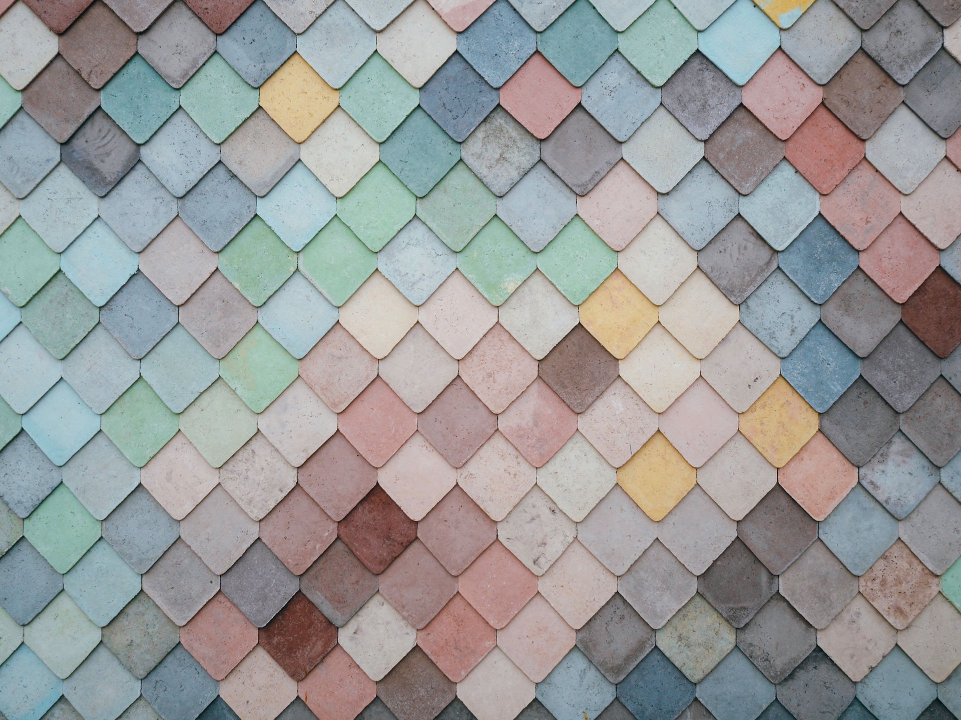
The last piece will be a painting from his last exhibition titled Thematic Series in 18 Colors A (figure 6). Completed in 1982, this piece goes back to his roots and early paintings by focusing on vertical lineage and color. This piece evokes a motion by having the cool toned colors stacking at a diagonal path while the high contrast between the warm colors blends into the gradient. Like in Four Symmetrical Groups (figure 3), Lohse uses pixel like gradients to trick the eye into naturally blending the colors. The colors are gradual mixes of three different colors (red-A, blue-B, and yellow-C) to create eighteen different colors causing a drastic transition between the three colors.
Looking at Lohse work, it is evident that he was inspired by line work and color combinations. He like many other artists, worked through hardships caused by war and political struggles that rampaged through his country. Lohse explored many options of content and styles but always returned to simple, pixel like work that used directional force to entice the consumer. His work has inspired graphic designers for generations and stretched across eastern Europe. Along with all these accomplishments, Lohse founded art conservatories, activist for the arts themselves and those that produced and worked in graphic design. Lohse was a pioneer in constructivism by creating his own style and technique when it came to photomontages and typography. Richard Paul Lohse will continue to make his mark on history with his unique paintings and advertising.
Figure 1
Coffee Pot
1925
Oil on Canvas
Figure 2
Construction with Triangles
1942
Oil on Pavatex
Figure 3
Four Symmetrical Groups
1947/1959
Oil on Canvas
Figure 4
Bauen & Wohnen 4
Magazine Title
1948
Figure 5
Lohse Galerie Ziegler
Exhibition Poster
1982
Figure 6
Thematic Series in 18 colors A
1982
Oil on Canvas
Bibliography
1. Stankowski, Anton, Visual Presentation of Invisible Processes: How to Illustrate Invisible Processes in Graphic Design. New York, Hastings House, 1967.
2. Cooke, Catherine, Russian Avant-Garde: Theories of Art, Architecture and the City, Academy Editions, 1995, Page 106
3. James, Johanna Lohse, Lohse: Biography (long). Richard Paul Lohse Foundation, 2012 (p. 1)
4. James, Johanna Lohse, Lohse: Biography (short). Richard Paul Lohse Foundation, 2012 (p. 2)
5. James, Johanna Lohse, Lohse: Painting. Richard Paul Lohse Foundation, 2012 (p. 3)
6. James, Johanna Lohse, Lohse: Graphic Design. Richard Paul Lohse Foundation, 2012 (p. 4)
7. James, Johanna Lohse, Lohse: Exhibitions. Richard Paul Lohse Foundation, 2012 (p. 5)
8. Merriam-Webster, Definition of Futurism, Merriam-Webster Publishing, 2015. (p. 1)
9. Merriam-Webster, Definition of Cubism, Merriam-Webster Publishing, 2015. (p. 2)
10. Merriam-Webster, Definition of Supremacism, Merriam-Webster Publishing, 2015. (p. 3)
11. ArtStory, Constructivism, The Art Story Foundation, 2016.


